
PEP Macro Revisiting Portfolio Efficiency
Negative skew - the biggest investment problem you never knew you had...!
There is a problem in investment that is rarely talked about, primarily because it is not well understood. It’s technical, but its effect is very significant. To address it requires thinking differently.
To explain it requires us to dig a little more deeply into the thinking around efficient portfolios, and the assumptions that are underlying this.
What is an efficient portfolio?
You have probably seen a chart showing an efficient frontier before. In simple terms, what this shows is that, if we could take all possible portfolios and evaluate their risk and return characteristics, we would get an efficient frontier – a series of portfolios that have the highest expected returns at different risk levels.
Theoretically, we should be able to draw a straight line from the y-axis so that it just touches the frontier. The point it intersects the y-axis should be the leverage cost (although often it’s just assumed to be the cash rate). The idea is that the portfolio at the point where the line touches the frontier is efficient, and it makes more sense either to mix that portfolio with cash, or to leverage it, to get to the risk level you want.
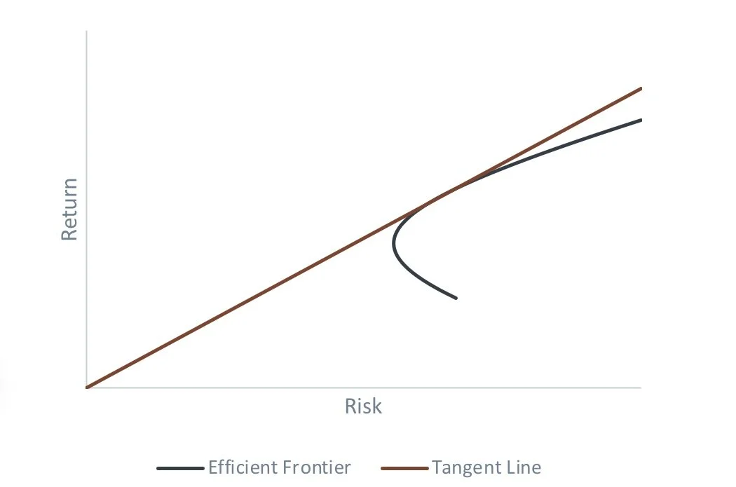
Source: Figures produced by PEP based on simulated data. Simulated performance is no indication of future results.
There is nothing wrong with these assumptions, provided the assumptions used are true, or at least true enough. For the purpose of this paper we’re going to ignore the question of whether the risk and return assumptions can actually be predicted effectively.
But there are two assumptions underlying this approach that merit real thought for anyone seeking to invest efficiently:
· The approach assumes the only objective relates to return and this characterization of risk.
· The approach assumes that volatility effectively characterizes risk.
We address the first question in a separate paper on “Portfolio Construction”. In our view investors generally have more objectives than just this. For the purposes of this paper, we will focus on the second question.
Does volatility effectively characterize risk?
The answer to this question depends a little on what you mean by risk. But we can say something about what risks volatility was intended to represent.
Consider the two charts below – one shows a return distribution for a portfolio with a return of 8% and a volatility of 15%. The other shows a return of 7.5% and a volatility of 8%.
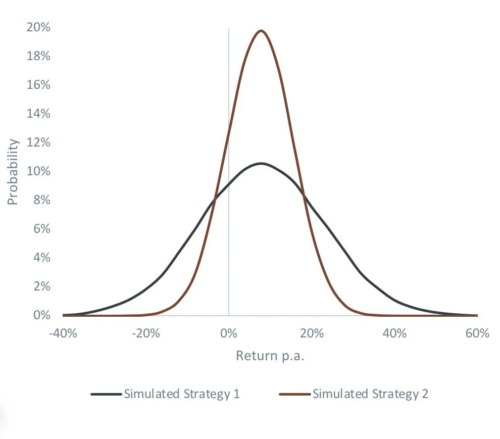
Source: Figures produced by PEP based on simulated data. Simulated performance is no indication of future results.
Note that the obvious difference between the two is the proportion of the distribution that is below zero. Simplistically, the second portfolio expects to spend less time going backwards. Now, this begs the first question about risk – does risk relate to the depth of the fall (when the portfolio value is going backwards), or the time spent going down and recovering? The answer is probably both – as an investor you would prefer to lose less on the way to making money and spend the shortest time recovering. On balance between these two, we would argue that recovery time is probably more important – if you knew you would recover quickly, you can cope with larger short-term losses.
In theory, the more efficient of the portfolios above should solve both problems – the extent of the drawdowns, and the time spent recovering, should be lower.
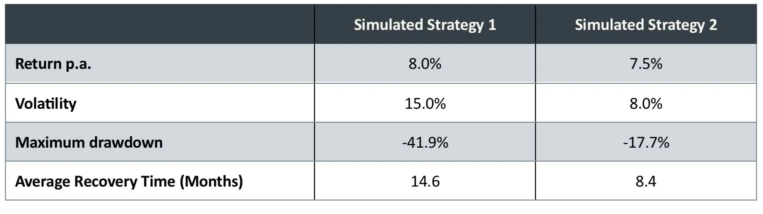
Source: Figures produced by PEP based on simulated data. Simulated performance is no indication of future results.
So far, the theory seems to be holding up, lower volatility does tend to lead to lower drawdowns and shorter recovery times.
This idea is where we see the benefit of diversification. It is very easy to demonstrate that, as long as the assets used are not highly correlated, mixing them together in some way tends to produce a better return to risk trade off. The table below illustrates this through mixing two assets. The x-axis shows the proportion of the portfolio in Strategy 1 and the remaining assets are invested in Strategy 2.
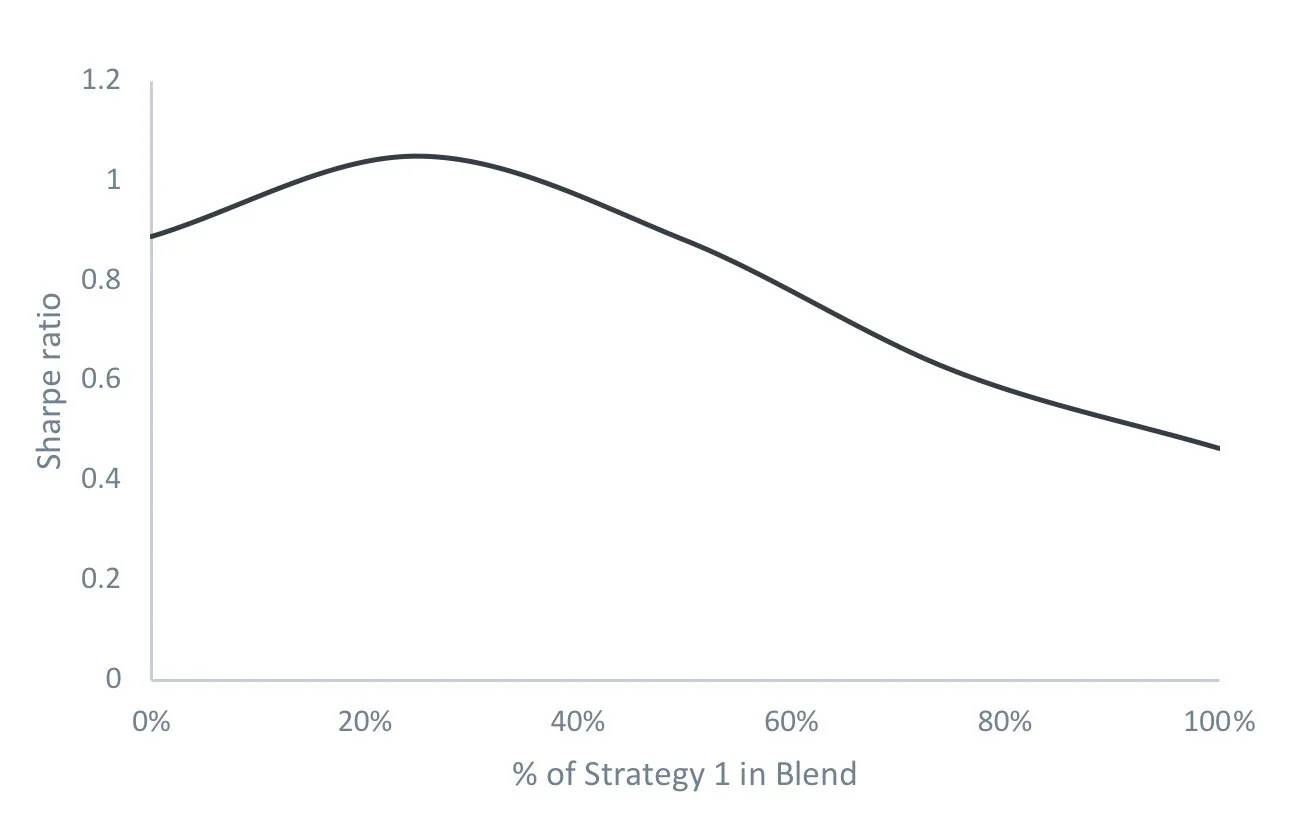
Source: Figures produced by PEP based on simulated data. Simulated performance is no indication of future results.
There is nothing earth shattering here – diversification is well understood in investment. Our point is simply to illustrate that the view of diversification producing greater efficiency comes from the above characterization of risk and return, which are so far based on thinking that is quite rational.
So where’s the problem? We turn to this next.
The problematic assumption
All the above thinking is based on one key assumption – that financial markets are well characterized by the normal distribution, otherwise known as the bell curve. This statistical distribution is characterized by return and volatility. The maths for mixing different assets that follow this distribution is relatively easy, which is one of the reasons this model is so prevalent.
It is well known that markets don’t follow a normal distribution though, and the problems with this are largely ignored simply because the maths gets very hard, very quickly. We generally assume that the problems aren’t so great that the model is still useful. However, in one respect, the problem is very great.
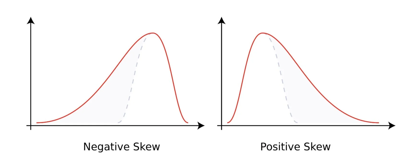
One critical aspect of the normal distribution is that it exhibits zero skew. This is the tendency for a distribution to lean one way or the other. The charts below illustrate positive and negative skew.
So what? Why should we care about this? The first reason is that financial markets – particularly equities, credit and commodities – exhibit negative skew. It’s probably intuitive that a negatively skewed return distribution will produce deeper drawdowns than a zero-skew distribution. But what is perhaps worse is that recovery time tends to be significantly worse as a result.
We illustrate this simplistically for equities in the table below. We have compared returns on the S&P500 to a simulation using the same return and volatility as the S&P, but where skew is neutralized.
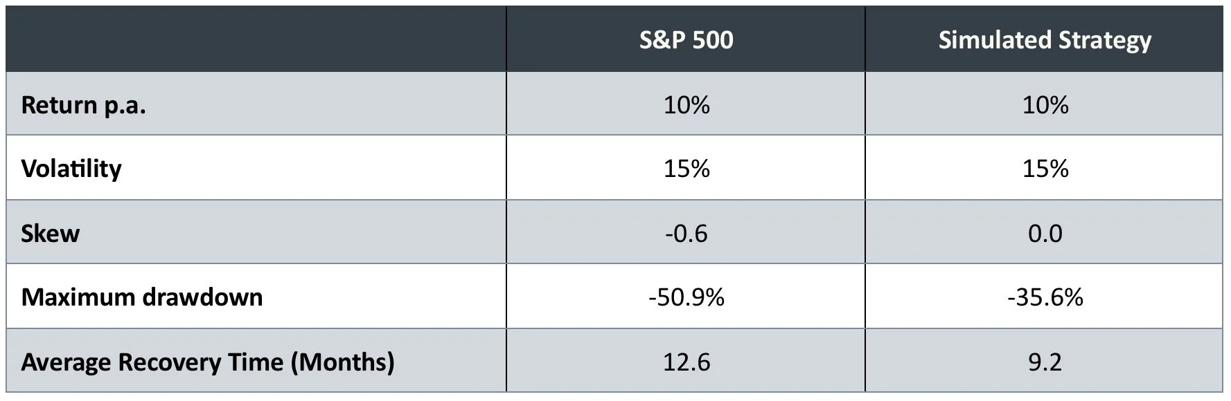
Source: PEP, Bloomberg. S&P 500 in USD from 12/31/1993 to 01/31/2024. Past and simulated performance is no indication of future results.
As can be seen, even with the same average return and volatility, the negative skew on the S&P500 results in worse drawdowns, and longer recovery times than for the simulated strategy. And the differences are significant.
But even if the results for an individual asset class are not great, surely diversification will help?
The big problem
Which brings us to the major problem that skew gives us. In a nutshell:
Diversification improves volatility, not skew
What we mean is – while diversifying across asset classes can improve your return per unit of risk, it generally won’t improve your skew.
In fact it’s worse than this. Often diversification makes the skew problem worse. The analysis below illustrates this. We show the statistics for each of three major asset classes (equities, commodities, bonds) and then the results for an equally weighted portfolio diversified across all three. As can be seen - volatility is lower. But the skew is actually worse than the skews of the individual asset classes!
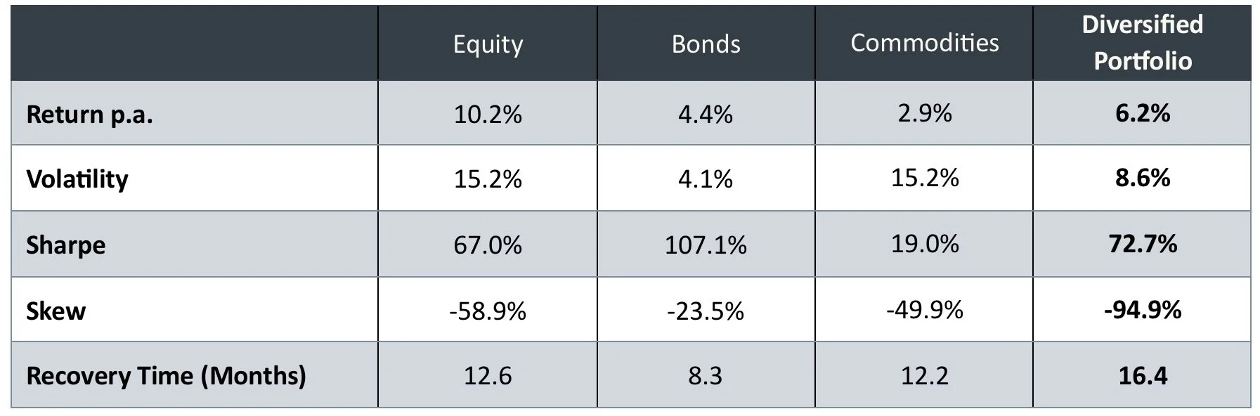
Source: PEP, Bloomberg. Equity represented by S&P 500 in USD. Bonds by Bloomberg US Agg Total Return Value Unhedged USD. Commodities by BCOM Total Return in USD. All performance taken from 12/31/1993 to 01/31/2024. Past and simulated performance is no indication of future results.
Why is this happening? Simplistically – it’s because diversification is doing more work on the right-hand side of the distribution than on the left. You’ve heard the idea that, in bad times, correlations go to 1? What this means is that on the left-hand side – the bad periods - there is less diversification effect than on the right. This accentuates the skew that is already there which means recovery time ends up being worse still.
So, where markets exhibit negative skew, traditional financial theory breaks down, especially where recovery time is considered to be a key measure of risk.
Understanding the sources of skew
There is a simple calculation we can do to illustrate where skew comes from. The VIX index is a measure of the volatility in the S&P500 derived from option pricing. It is really a measure of liquidity in the market – the less liquidity, the higher the cost of protection and the higher VIX will be.
If we assumed we had perfect foresight on VIX, and simply weighted our allocation to the S&P500 based on VIX (i.e. lowered the weight when we have higher VIX) we can derive a theoretical perfect foresight strategy. We have based this on monthly returns, with perfect foresight of VIX at the end of the month. The results are shown below against the S&P.
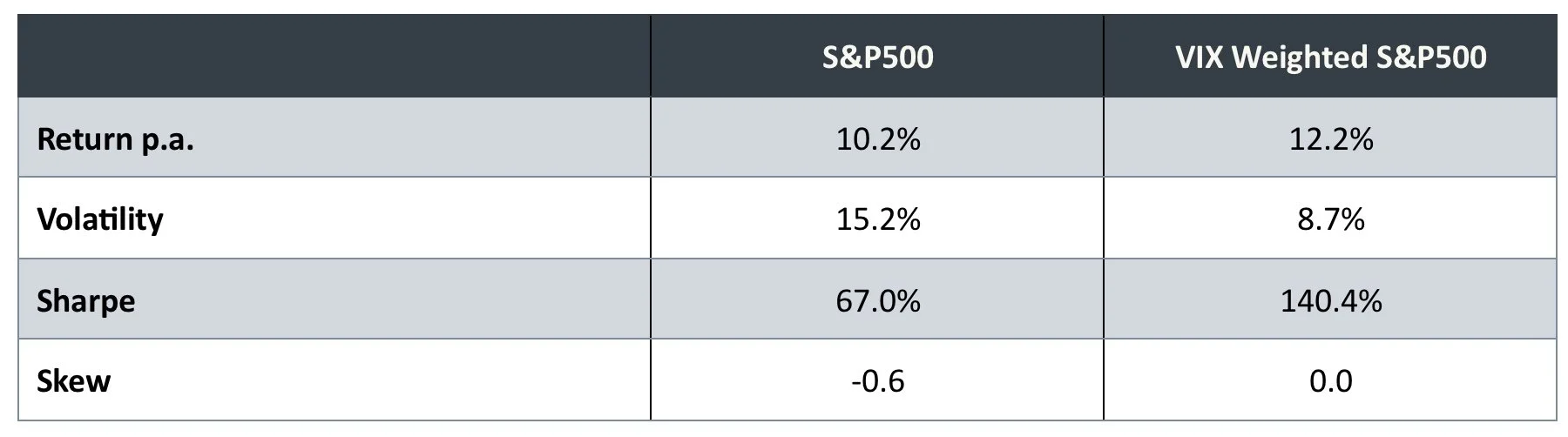
Source: PEP, Bloomberg. S&P 500 in USD from 12/31/1993 to 01/31/2024. Past and simulated performance is no indication of future results.
As can be seen, knowing where the VIX will end up would allow us to eliminate skew altogether. While it is intuitively logical that greater illiquidity should result in higher volatility, this analysis demonstrates that this is supported analytically. The reason markets exhibit negative skew is because this illiquidity tends to occur to the downside. If illiquidity occurred on the upside, we would have the opposite effect and no problem.
Similarly, the reason we have a portfolio skew problem is that correlations are greater to the downside, again as a result of illiquidity, and therefore portfolio volatility is much higher to the downside than on the upside.
This gives us some insight into how to approach thinking about skew. Intuitively, negative skew can be created in two ways:
· In the short run by having more volatility on the downside than there is on the upside
· At longer terms through “ordering”. When we get more short-term losses in a row, if these are generally more volatile, this ordering will lead to deeper losses than we see gains on the upside. This is also a potentially significant impact over longer horizons.
In practice, both sources are important, and we can demonstrate this. Using our proprietary economic condition analysis, we divide the S&P500 history into expansionary and contractionary phases. The table below shows the average annualized return and volatility, along with the proportion of time spent in each phase.
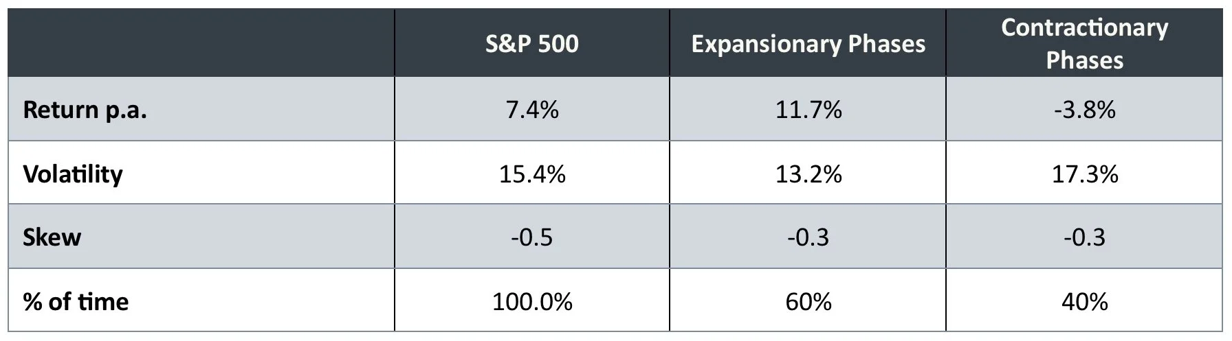
Source: PEP, Bloomberg. S&P 500 in USD from 06/30/1999 to 01/31/2024. Table based on output from PEP’s proprietary models. Past and simulated performance is no indication of future results.
As can be seen, these distributions are very different, in both return and volatility. Knowing this gives us a way to approach addressing skew, as these economic conditions tend to persist for periods of time.
In the next section, we use this approach to explore how this model can help us understand conceptually how to address skew.
Addressing negative skew
The biggest driver of negative skew from the above example is the ratio of volatility between the two distributions. The volatility in contractionary phases is roughly 130% of the volatility in expansionary phases. So the downside volatility dominates the upside.
The chart below shows how skew changes with the ratio of contractionary vs expansionary volatility. A high number for the ratio indicates higher volatility in the contractionary phases, relative to the expansionary phases.
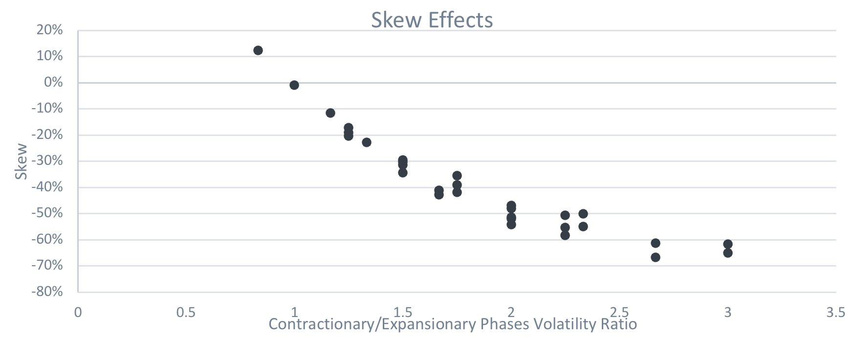
Source: Figures produced by PEP based on simulated data and PEP’s proprietary models. Simulated performance is no indication of future results.
For completeness, the chart below shows the same simulations but now against their recovery times. In both cases the relationship is strong.
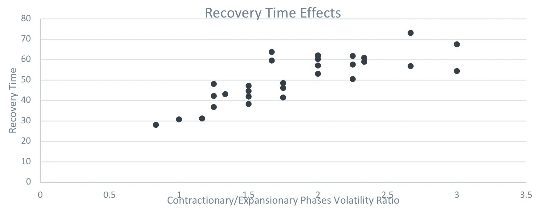
Source: Figures produced by PEP based on simulated data and PEP’s proprietary models. Simulated performance is no indication of future results.
As can be seen - reducing the downside volatility relative to the upside volatility neutralizes skew. The critical insight to addressing skew is to re-balance the difference between upside and downside volatilities.
Among other things this highlights the importance of reducing downside risk and hedging.
It’s worth noting that the average returns and Sharpe ratios do also have an effect on the skewness, however this does not transfer to the recovery time as directly as can be seen with the ratio of volatilities.
A return to normality?
The analysis in this paper paints the picture that tackling the skew problem, through neutralizing negative skews, allows us to think in more normal finance theory terms again.
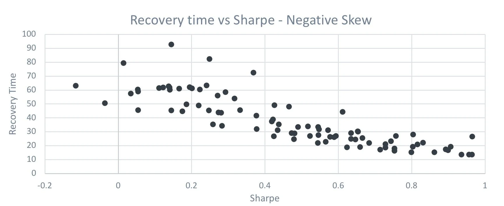
One element of this is the relationship between recovery time and Sharpe ratio. Ignoring skew, there will normally be a strong relationship between the two. Take the below for example, where we have charted a number of simulations at a similar negative skew level to compare recovery time and Sharpe ratio.
Source: Figures produced by PEP based on simulated data and PEP’ proprietary models. Simulated performance is no indication of future results.
Quite clearly the highest Sharpe ratios provide us with the best recovery times. Although the above isn’t a ‘perfect’ picture. Now consider the below, which is the same analysis, but we have taken simulations around a neutral skew level.
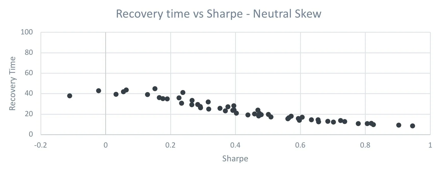
Source: Figures produced by PEP based on simulated data and PEP’s proprietary models. Simulated performance is no indication of future results.
Now that the skew is neutralized, the relationship is far better behaved. So once you tackle the skew problem you have far more control over some significant portfolio characteristics.
This is intuitive – negative skew dominates Sharpe given it arises from greater downside volatility. But as skew is neutralized, the effectiveness of Sharpe ratio efficiency dominates.
Simplistically – if you neutralize skew, traditional investment theory works fine.
Summary
We believe negative skew represents a significant problem to investors, and one that is not well understood.
In this paper we have shown that:
· Efficient Portfolio theory works well for asset classes exhibiting returns that are normally distributed
· Where returns are negatively skewed though, traditional financial theory can worsen the situation (in particular as it relates to recovery time)
· Diversification does add value in other ways, and we do not advocate abandoning it, but it does produce a “skew problem”
· Skew can be understood as coming from two different distributions – upside and downside, coupled with persistent ordering (ie each distribution persists for a meaningful periods of time)
· Addressing skew involves moving the volatilities of the upside and downside distributions closer together. Ideally the upside volatility would be greater than the downside.
· Successfully addressing negative skew in this way has a significant effect on the recovery time. It also improves the effectiveness of traditional Sharpe ratio approaches to portfolio efficiency. If you neutralize negative skew, traditional finance theory works fine.
Overall, addressing negative skew requires thinking differently. We cover practical implications for addressing negative skew in a separate paper.
Appendix - a quick look at time horizons
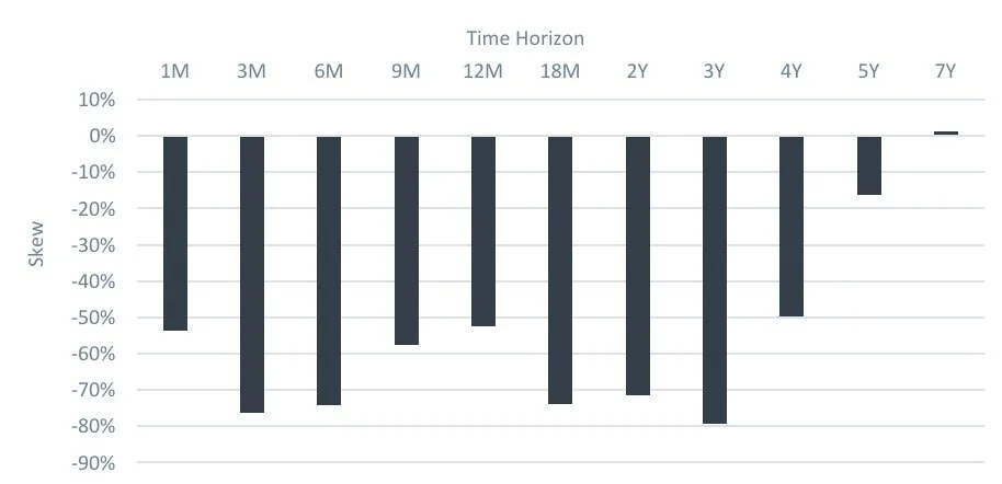
An important subsequent question is over what time horizon do we care about skew? Looking at the skews for the S&P500 at different time horizons we see the following.
Source: PEP, Bloomberg. S&P 500 in USD from 12/31/1993 to 01/31/2024. Past performance is no indication of future results.
As the chart shows, negative skew is significant for all periods out to around three to four years, and by five years they have vanished. This is good news for people who genuinely have time horizons longer than five years and are unconcerned about the journey. But for the vast majority of investors, the journey matters, even if the investing horizon is long term.
Does a particular horizon matter more than others? One could argue they all matter, but clearly long horizons matter more. This is because the impact of negative skew creates deeper losses, which in turn create longer recovery times. Therefore, while we would like to see all the skews removed, the longer term ones matter more.
CONFIDENTIAL INFORMATION: The information herein has been provided solely to the addressee in connection with a presentation by Public Equity Partners LLC on condition that it not be shared, copied, circulated or otherwise disclosed to any person without the express consent of Public Equity Partners LLC.
INVESTMENT ADVISOR: Investment advisory services are provided by Public Equity Partners LLC, an investment advisor registered with the US Securities and Exchange Commission.
SIMULATED PERFORMANCE: The simulated performance was derived from the retroactive application of a model with the benefit of hindsight. Performance results do not represent actual trading. Performance does not include material economic and market factors that might have impacted the adviser's decision making when using the model to manage actual strategies. Performance does not reflect the deduction of advisory fees, brokerage or other commissions, mutual fund exchange fees, and other expenses a client may be required to pay.
PAST PERFORMANCE IS NOT AN INDICATION OF FUTURE RESULTS.
SECURITY INDICES: This presentation includes data related to the performance of various securities indices which may provide an appropriate basis for comparison with underlying investments and the client’s total investment portfolio. The performance of securities indices is not subject to fees and expenses associated with investment funds. Investments cannot be made directly in the indices. The information provided herein has been obtained from sources which Public Equity Partners LLC believes to be reasonably reliable but cannot guarantee its accuracy or completeness.
Actuarial and investment consulting - Macro investment strategies Pension annuity purchases - Pension plan termination - Derivative strategies - Pooled employer plan consulting - OCIO